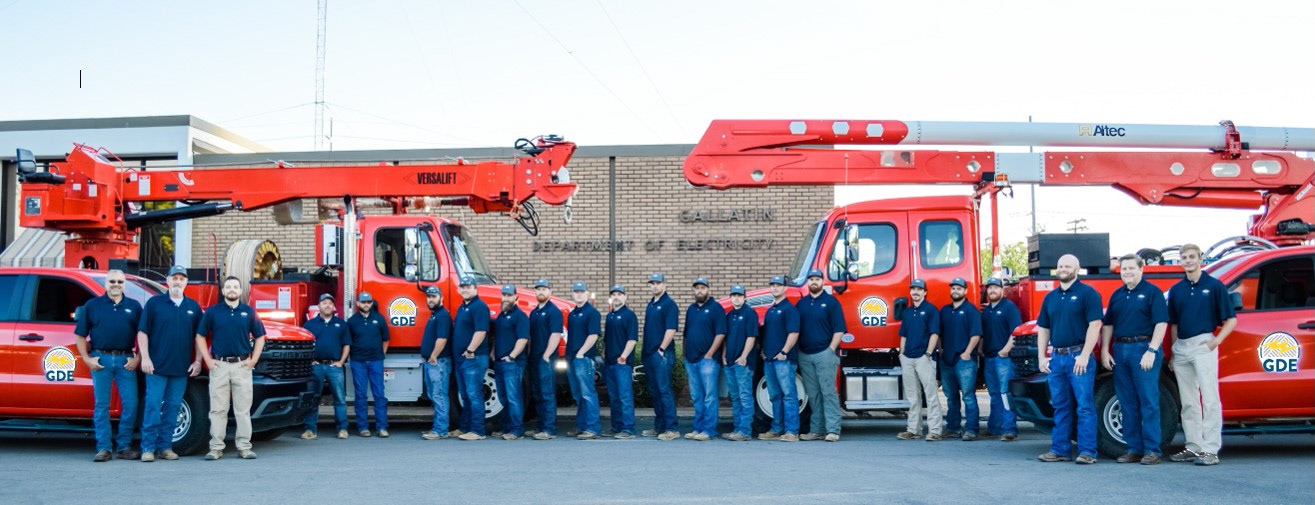
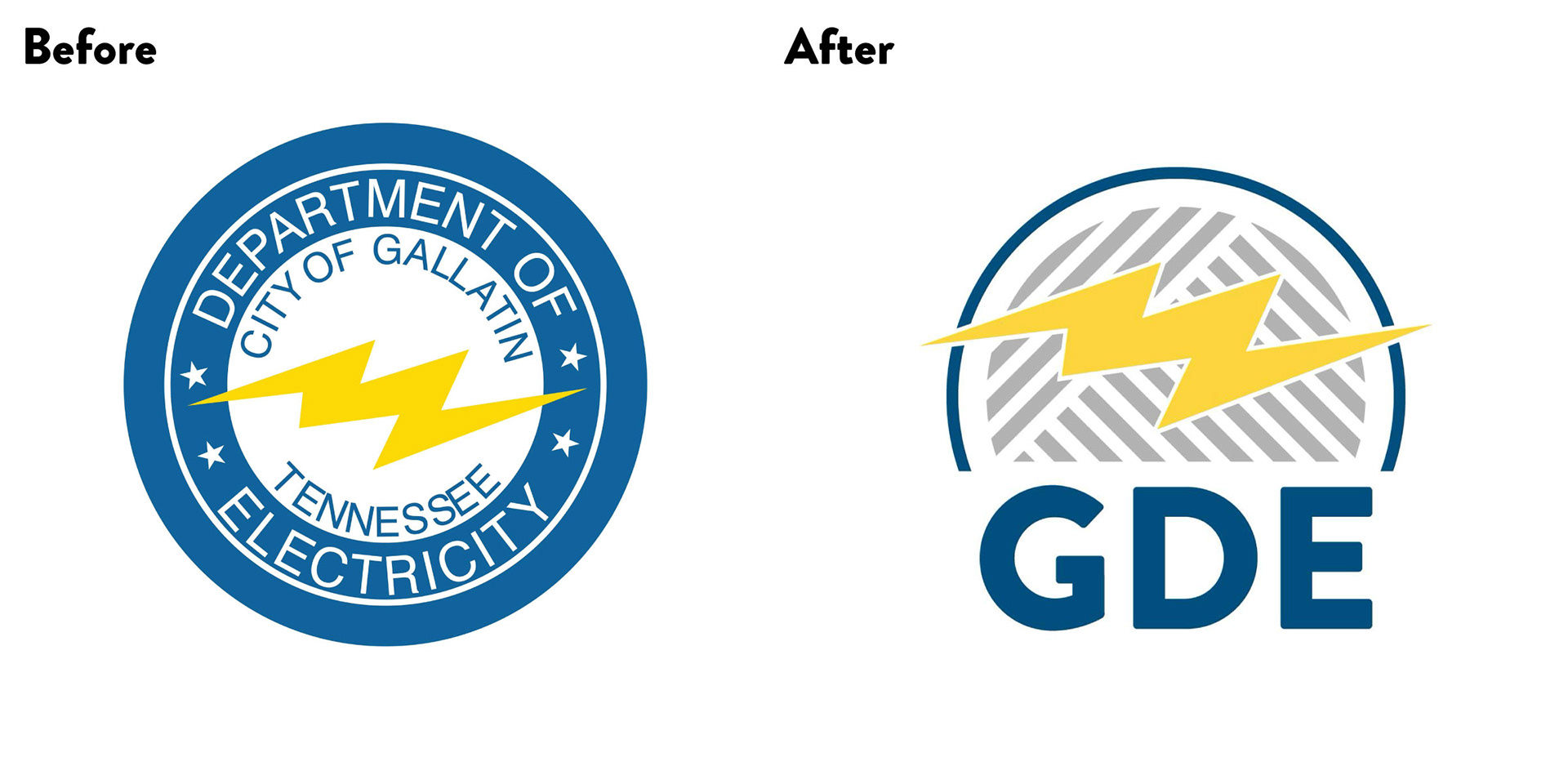
Designing anything for the City of Gallatin is always an exciting opportunity, and that was especially true when the Gallatin Department of Electricity approached me for a full brand refresh to better align with the city’s evolving visual identity. It’s incredibly rewarding to see their linemen and bucket trucks out in the community, proudly displaying the updated logo design on uniforms, vehicles, and equipment.
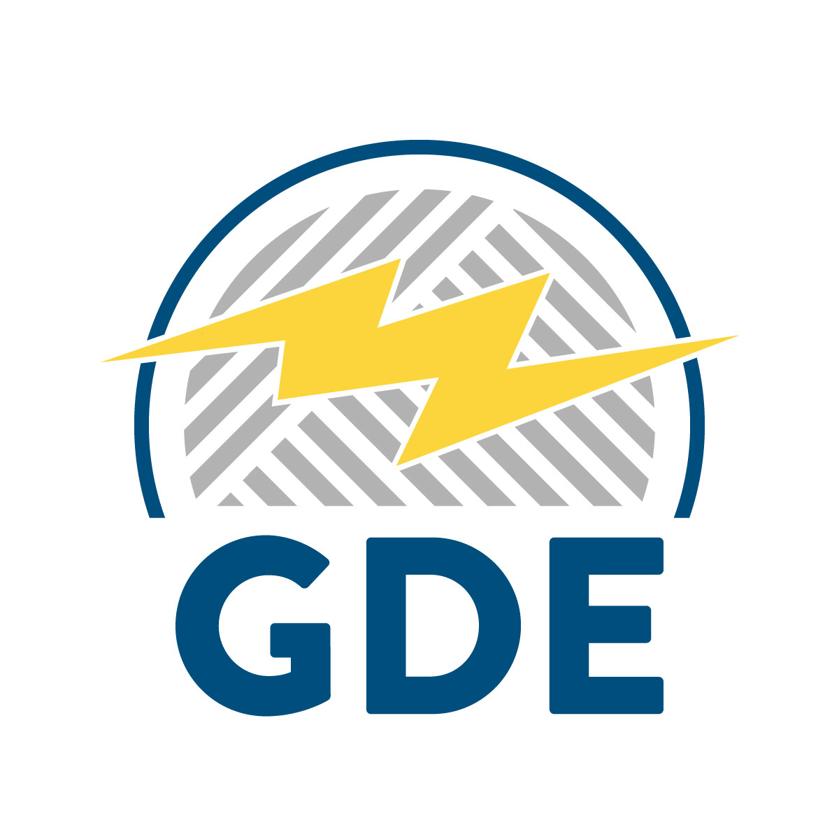
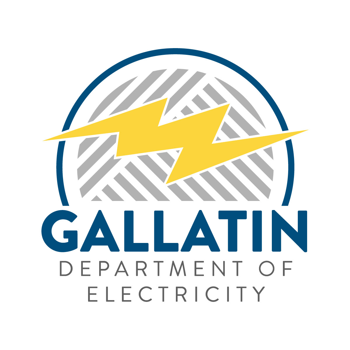
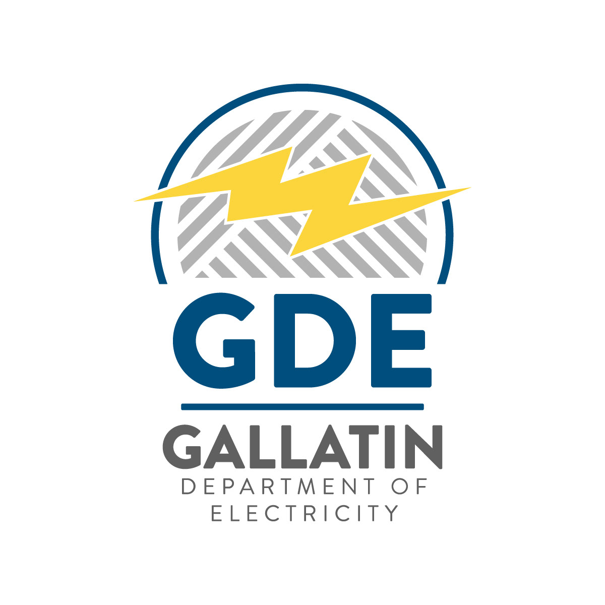
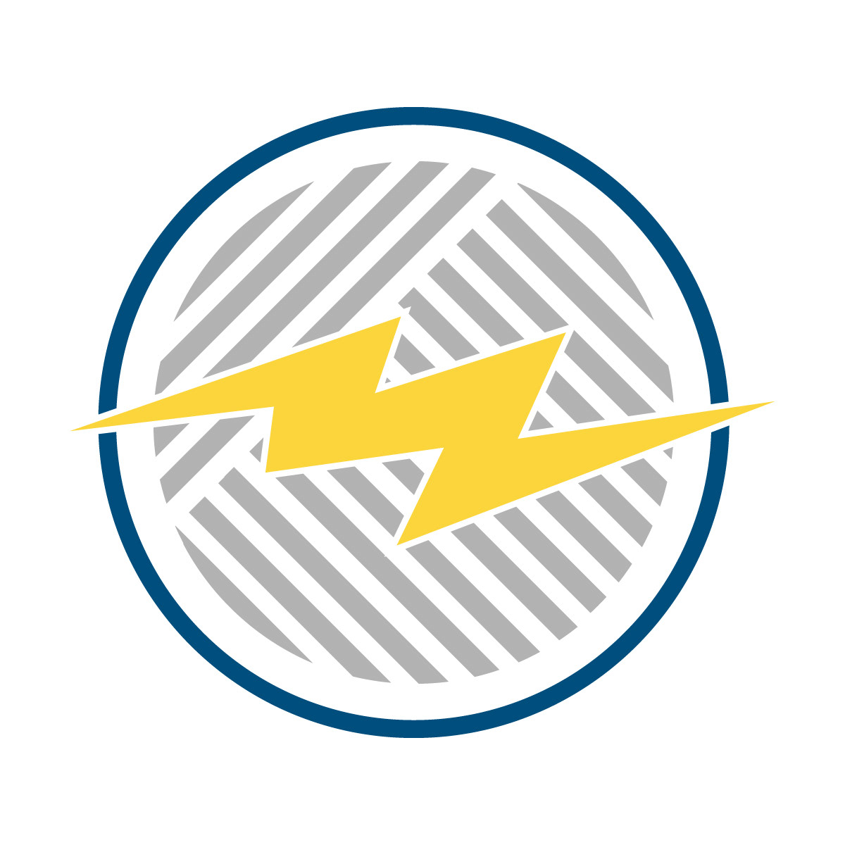
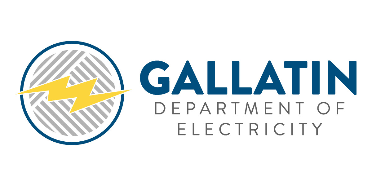
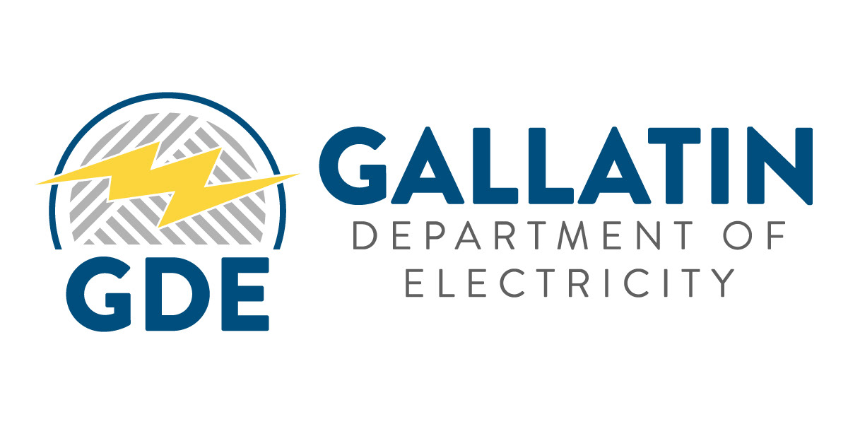
For this rebrand, I modernized and streamlined their existing logo, creating a cleaner, more contemporary mark while preserving elements important to their heritage. I incorporated the signature “land lines” from the main Gallatin brand, selected a more current and legible typeface, and retained their traditional color palette. The iconic lightning bolt—symbolizing the power they work tirelessly to maintain—was refined and integrated into a cohesive visual identity system.
Below, you can explore the full range of logo variations developed for the Gallatin Department of Electricity.